Landing / Marketing Page
A polished product marketing page — hero, features, testimonials, pricing tiers, and FAQ — showcasing the three AgnosticUI Lab animated components across React, Vue, and Lit.
Try it Live
Open any framework example directly in StackBlitz:
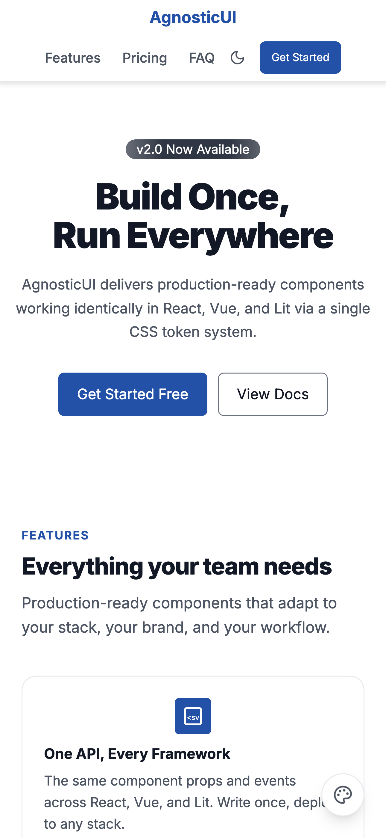
Mobile
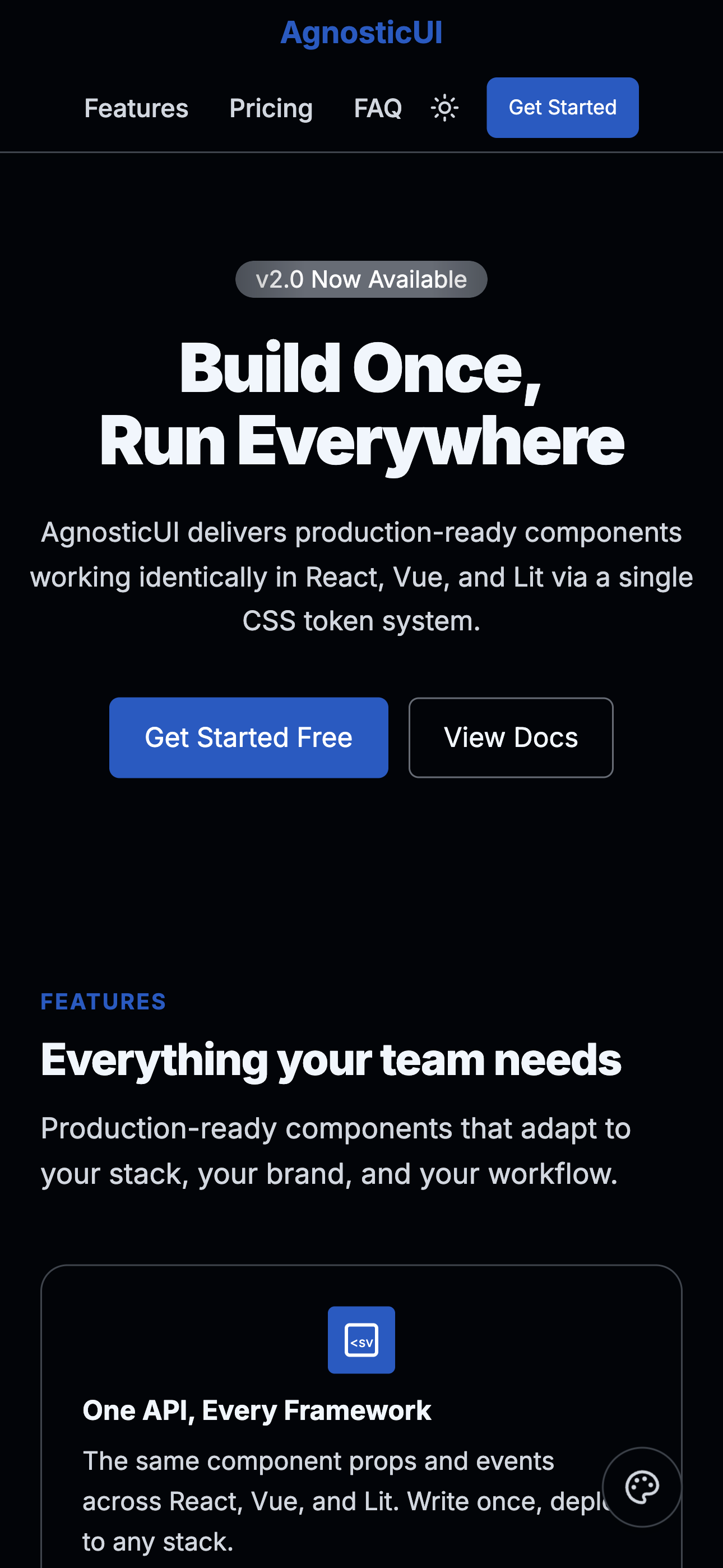
Mobile - Dark
Tablet
Tablet - Dark
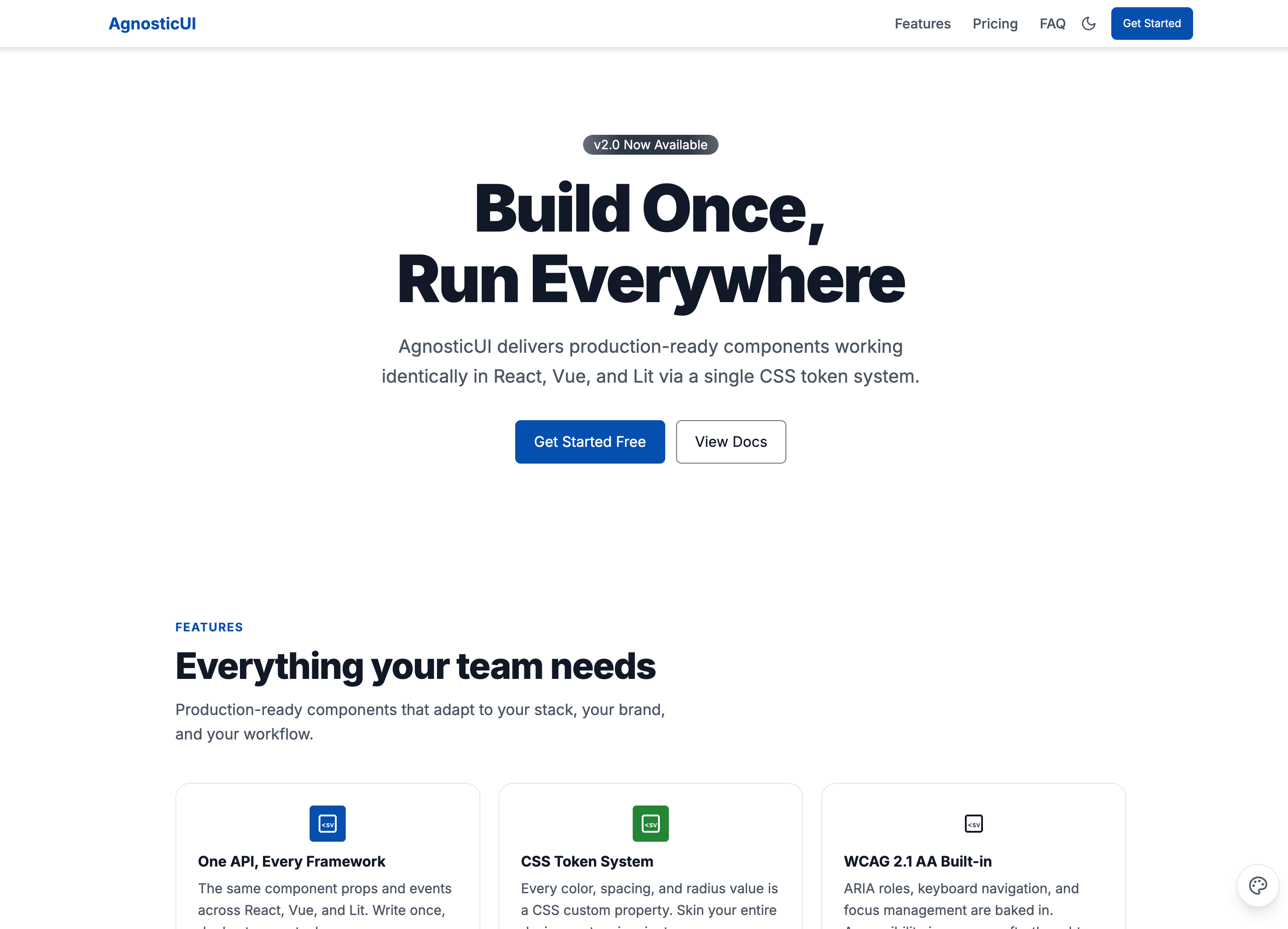
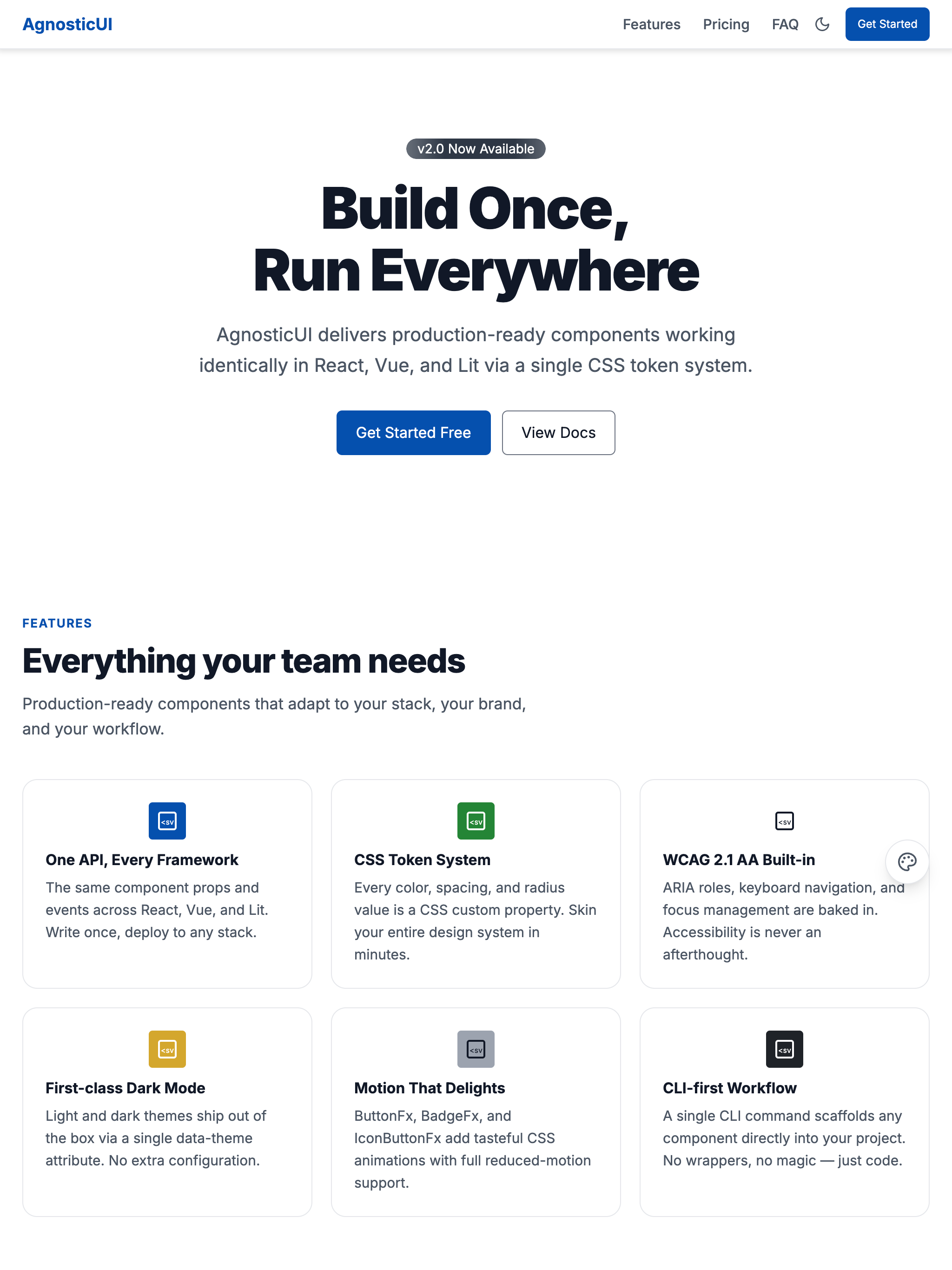
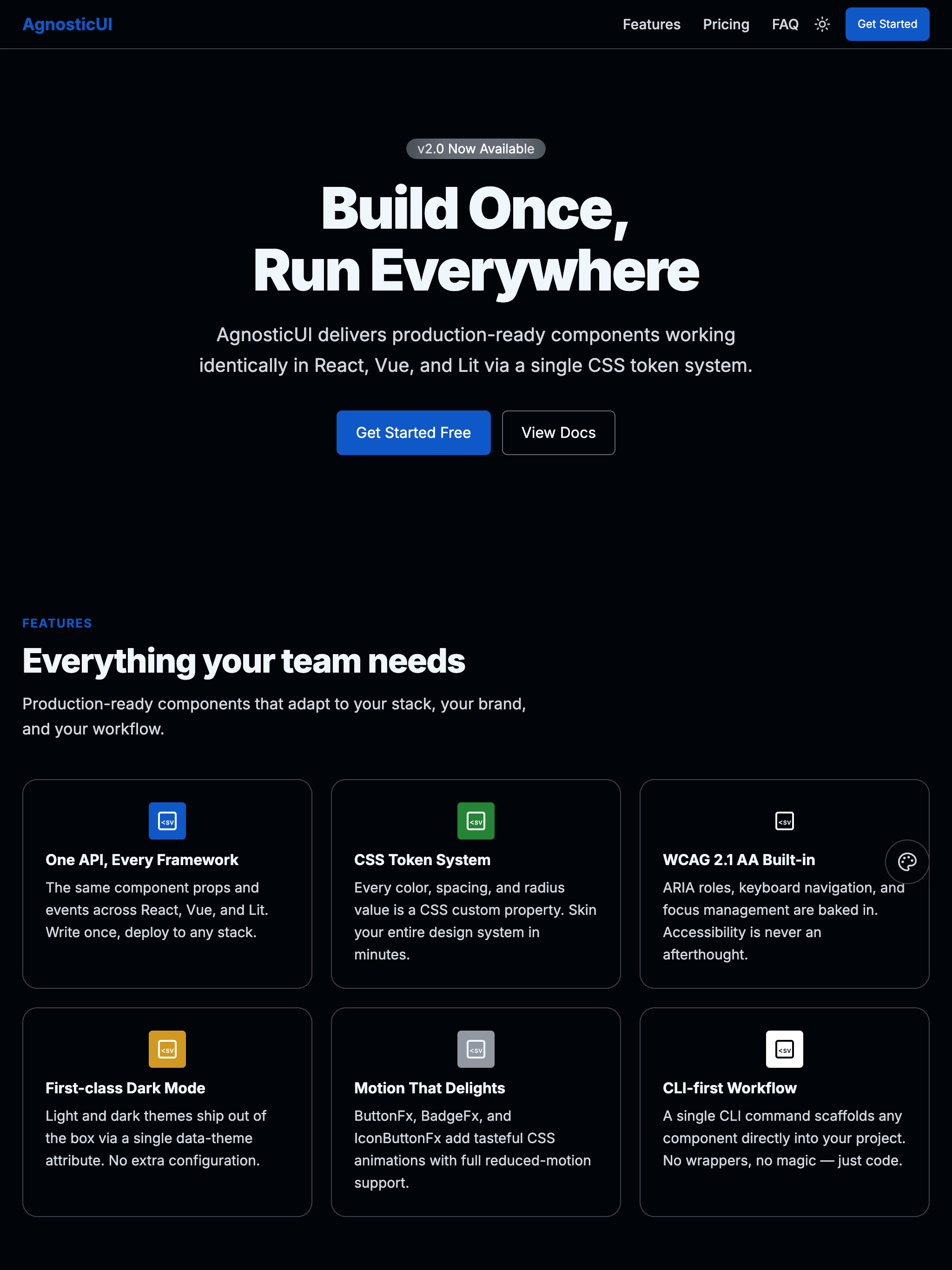
Desktop
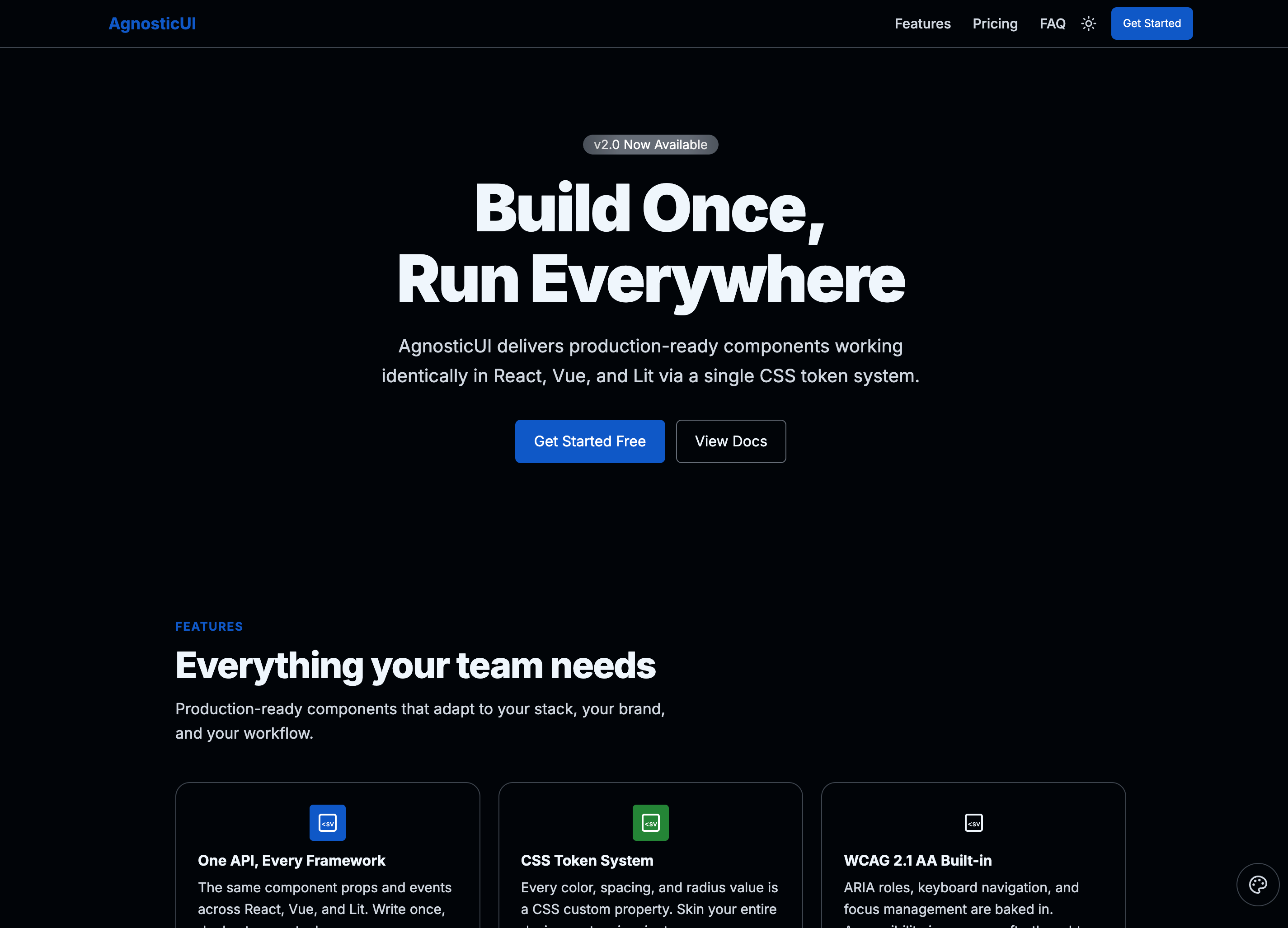
Desktop - Dark
Skins & Customization
Each live example includes a skin switcher (bottom-right corner) to preview other themes instantly. Colors, spacing, and typography are fully customizable via design tokens.
What's Included
Experimental Feature: AI-Assisted UI Generation
Generating UI components via LLM prompting is non-deterministic; different models (and even different versions of the same model) can produce drastically varying results from identical prompts.
While these prompts have been tested using the Claude Code CLI (running Claude Sonnet 4.5 and Opus 4.5), the output remains experimental. Always verify generated code for visual consistency, accessibility, and production readiness before deployment.
- Three framework examples: React, Vue, and Lit implementations
- ButtonFx — primary "Get Started" hero CTA with animated pulse/wobble press effect
- BadgeFx — "What's New" animated shimmer pill in the hero section
- IconButtonFx — feature-grid icon buttons with animated bounce-on-hover
- Full page sections: Hero, Features, Testimonials, Pricing (monthly/annual toggle), FAQ, Footer
- Light/dark mode toggle wired to
data-themeattribute PROMPT-3-FRAMEWORKS.md: Feed directly to your LLM for AI‑assisted customization
Using with an LLM
The PROMPT-3-FRAMEWORKS.md file contains everything an AI assistant needs to understand and modify the landing page:
- Copy the
PROMPT-3-FRAMEWORKS.mdcontents - Paste into Claude, ChatGPT, or your preferred LLM
- Ask for customizations: "Add a social proof section with logos of companies using the product"
Components Used
| Component | Purpose |
|---|---|
ag-button-fx | Hero primary CTA — animated pulse/wobble press effect |
ag-badge-fx | "What's New" hero pill — animated shimmer |
ag-icon-button-fx | Feature-grid icon buttons — animated bounce on hover |
ag-header | Sticky top navigation with logo, nav links, and theme toggle |
ag-button | Secondary hero CTA and pricing tier action buttons |
ag-card | Feature cards, testimonial cards, and pricing tier cards |
ag-badge | Pricing tier labels (e.g. "Popular") |
ag-avatar | Testimonial author avatars |
ag-tabs | Monthly / Annual pricing period toggle |
ag-accordion | FAQ section — collapsible question / answer pairs |
ag-divider | Section separators between major page sections |
ag-tag | Feature category labels |
Responsive Behavior
| Breakpoint | Layout |
|---|---|
| Mobile (<768px) | Single-column stacked layout; hero centered, sections full-width |
| Tablet (768–1023px) | 2-column feature and testimonial grids; pricing stacked |
| Desktop (≥1024px) | 3-column feature and testimonial grids; 3-column pricing |