Blog / Article Reader
A typography-first editorial layout with scroll-aware components, in-article search highlighting, and a simulated article fetch — implemented across React, Vue, and Lit.
Try it Live
Open any framework example directly in StackBlitz:
Mobile
Mobile - Dark
Tablet
Tablet - Dark
Desktop
Desktop - Dark
Skins & Customization
Each live example includes a skin switcher (bottom-right corner) to preview other themes instantly. Colors, spacing, and typography are fully customizable via design tokens.
What's Included
Experimental Feature: AI-Assisted UI Generation
Generating UI components via LLM prompting is non-deterministic; different models (and even different versions of the same model) can produce drastically varying results from identical prompts.
While these prompts have been tested using the Claude Code CLI (running Claude Sonnet 4.5 and Opus 4.5), the output remains experimental. Always verify generated code for visual consistency, accessibility, and production readiness before deployment.
- Three framework examples: React, Vue, and Lit implementations
- ScrollProgress — fixed top bar showing read progress as the user scrolls
- ScrollToButton — floating button (bottom-right) that appears after scrolling past ~30% of the article
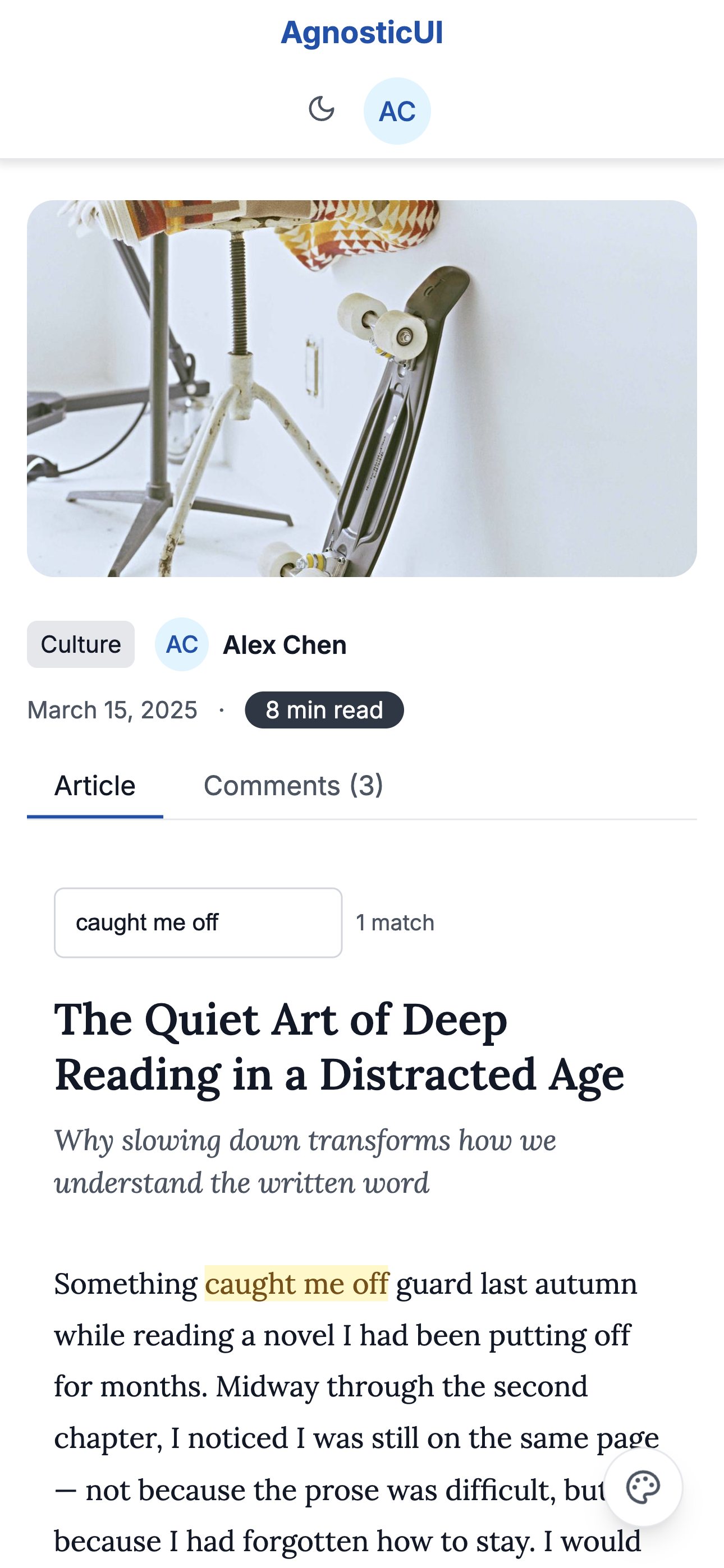
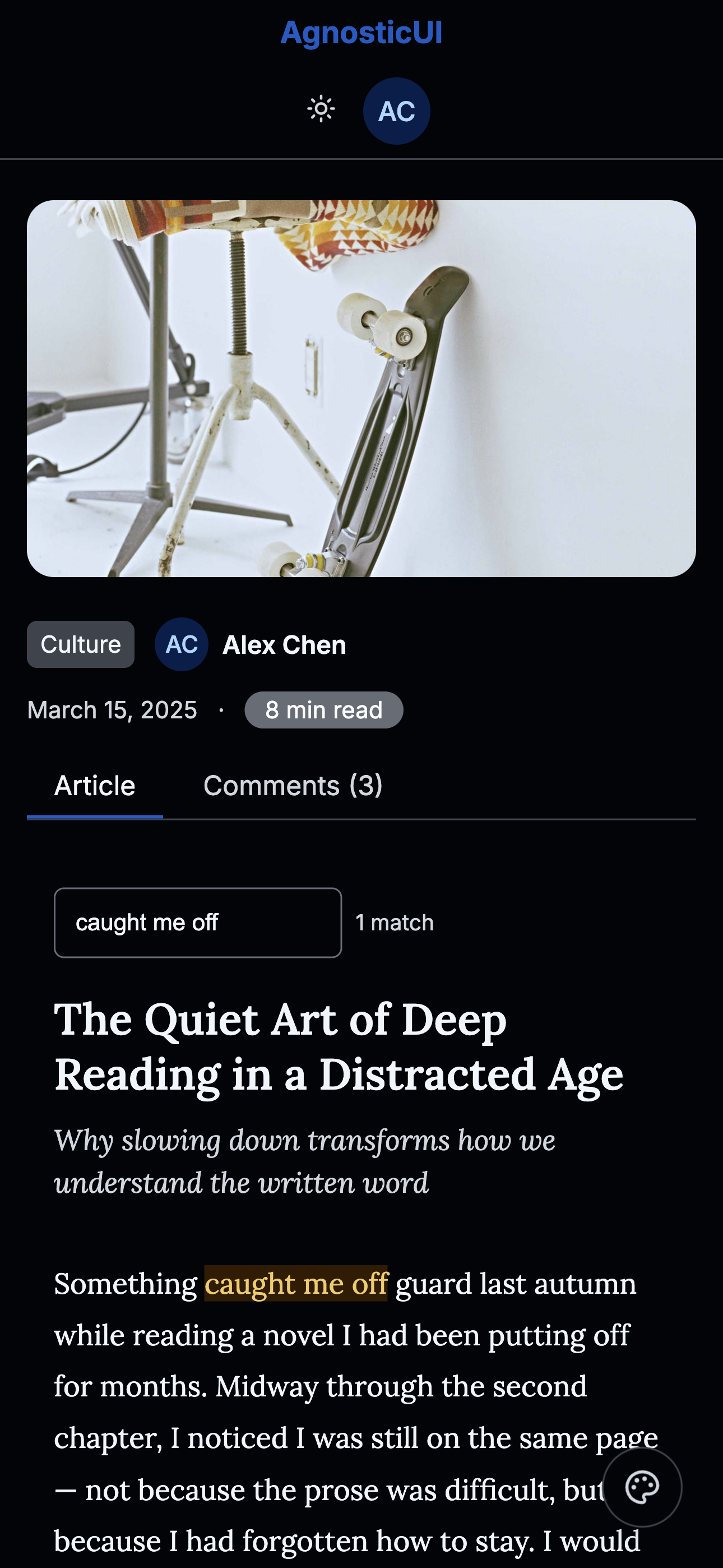
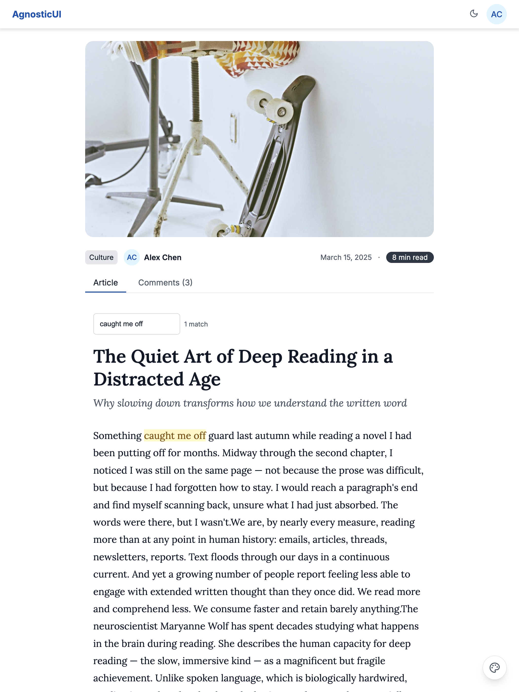
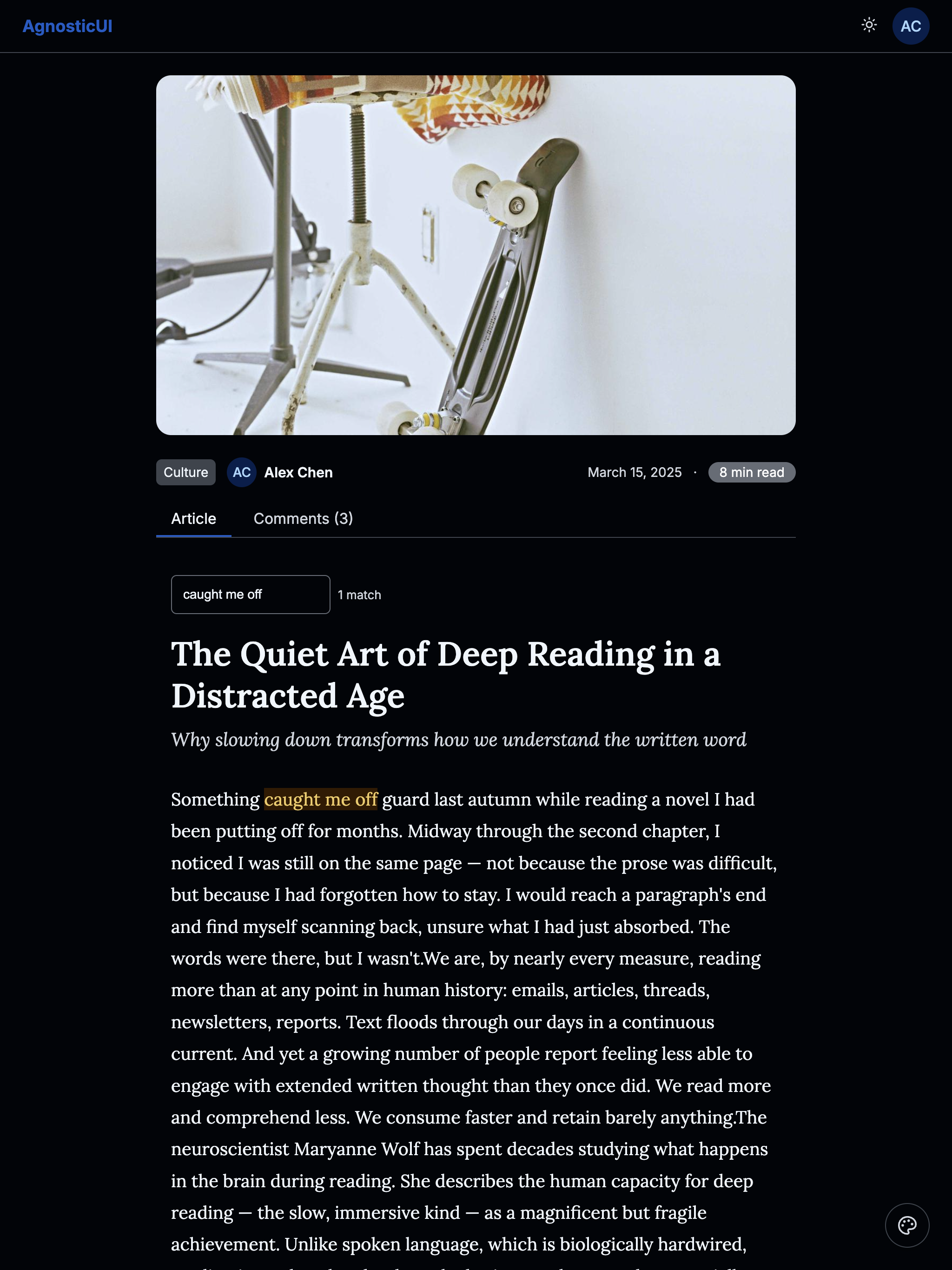
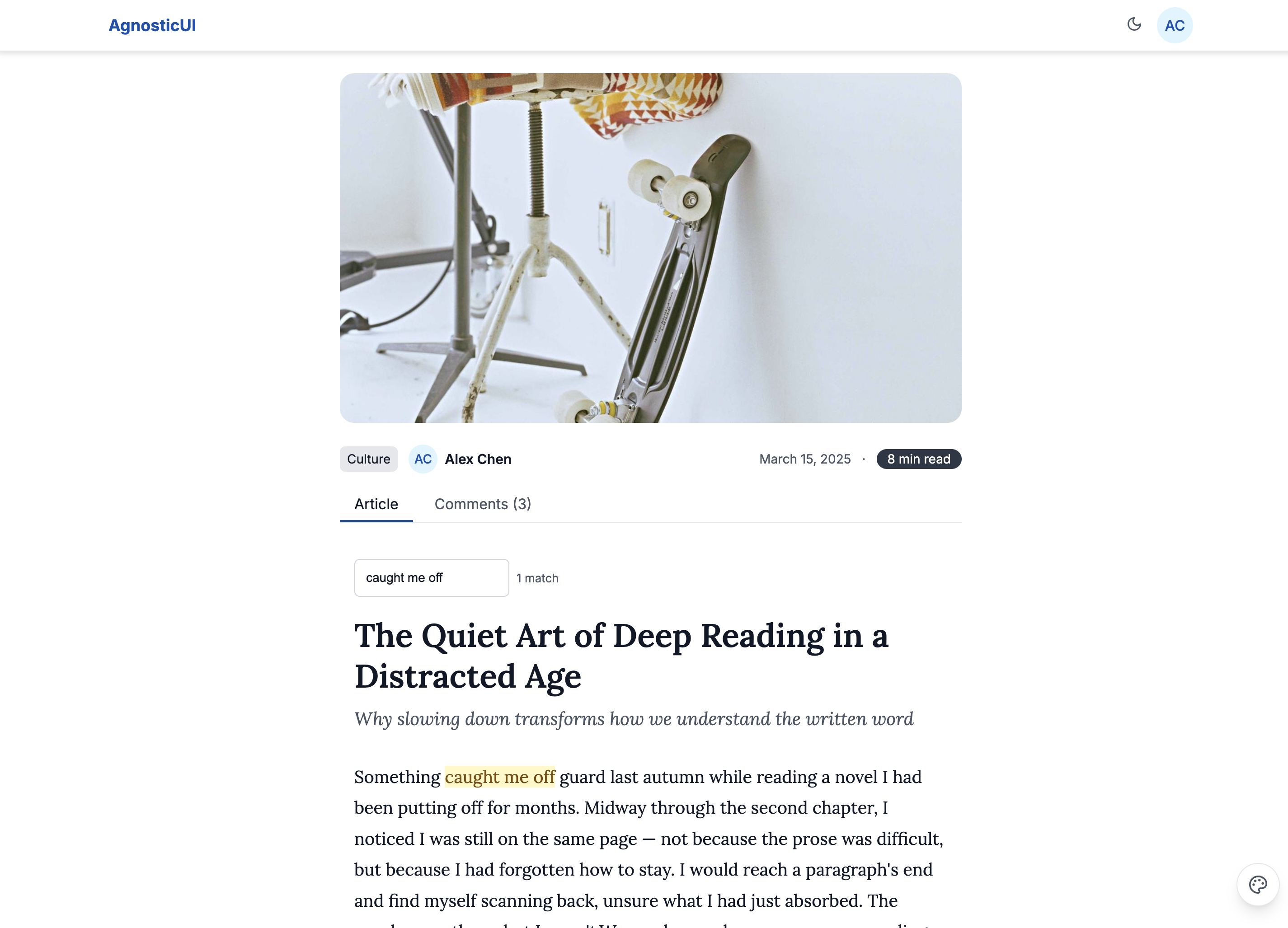
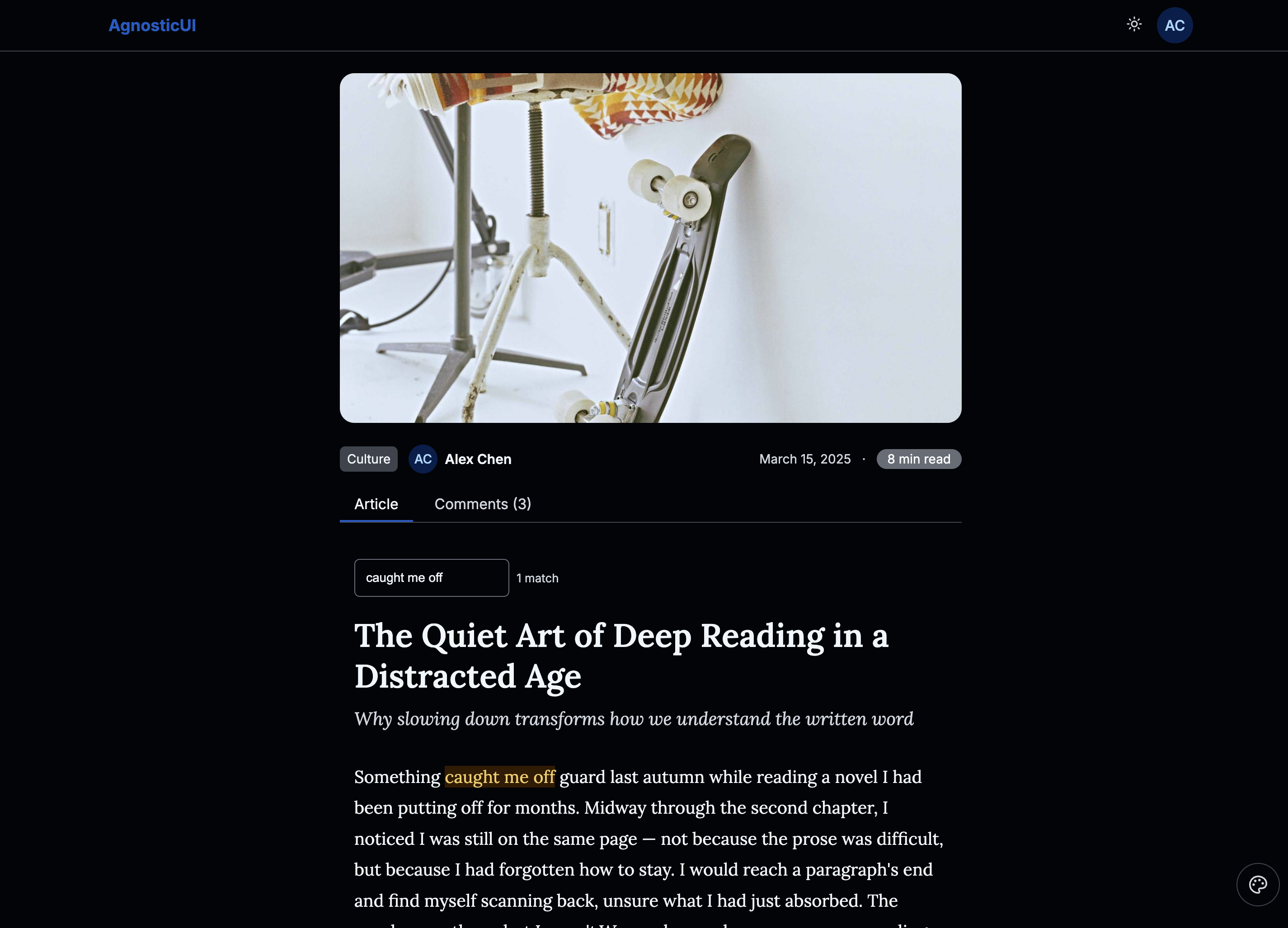
- Mark — "Find in article" feature that highlights matching search terms inline
- AspectRatio — wraps the hero image to enforce a consistent 16:9 ratio across all breakpoints
- Loader — shown on initial load before article content appears (simulated async fetch)
PROMPT-3-FRAMEWORKS.md: Feed directly to your LLM for AI‑assisted customization
Using with an LLM
The PROMPT-3-FRAMEWORKS.md file contains everything an AI assistant needs to understand and modify the article reader:
- Copy the
PROMPT-3-FRAMEWORKS.mdcontents - Paste into Claude, ChatGPT, or your preferred LLM
- Ask for customizations: "Add a table of contents sidebar that highlights the active section as the user scrolls"
Components Used
| Component | Purpose |
|---|---|
ag-scroll-progress | Fixed top progress bar showing read depth |
ag-scroll-to-button | Floating back-to-top button, visible after 30% scroll |
ag-mark | Inline text highlighting for the "Find in article" search |
ag-aspect-ratio | Hero image wrapper enforcing a consistent 16:9 ratio |
ag-loader | Full-page loading state before article content renders |
ag-header | Top navigation bar with logo and theme toggle |
ag-avatar | Author portrait in the article meta and author card |
ag-badge | Reading time estimate displayed in the article header |
ag-input | "Find in article" search field |
ag-divider | Section separators between article body, author card, and more |
ag-tabs | Article / Comments tab panel below the article body |
ag-tag | Article category label in the header meta |
Responsive Behavior
| Breakpoint | Layout |
|---|---|
| Mobile (<768px) | Full-width single column, hero image full-bleed |
| Tablet (768–1199px) | Centered column ~680px, hero image full-width |
| Desktop (≥1200px) | Centered reading column ~720px max with generous side margins |