Data Grid
A realistic e‑commerce inventory admin screen with three swappable grid implementations: AgnosticUI Table, Grid.js, and TanStack Table — across React, Vue, and Lit.
Try it Live
Open any framework example directly in StackBlitz:
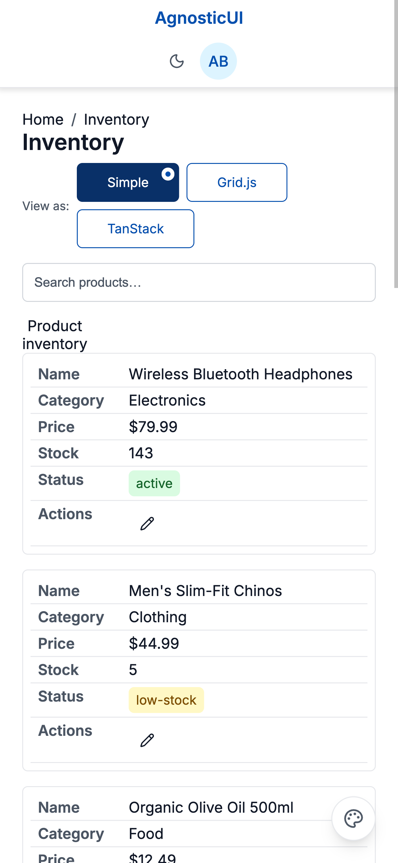
Mobile
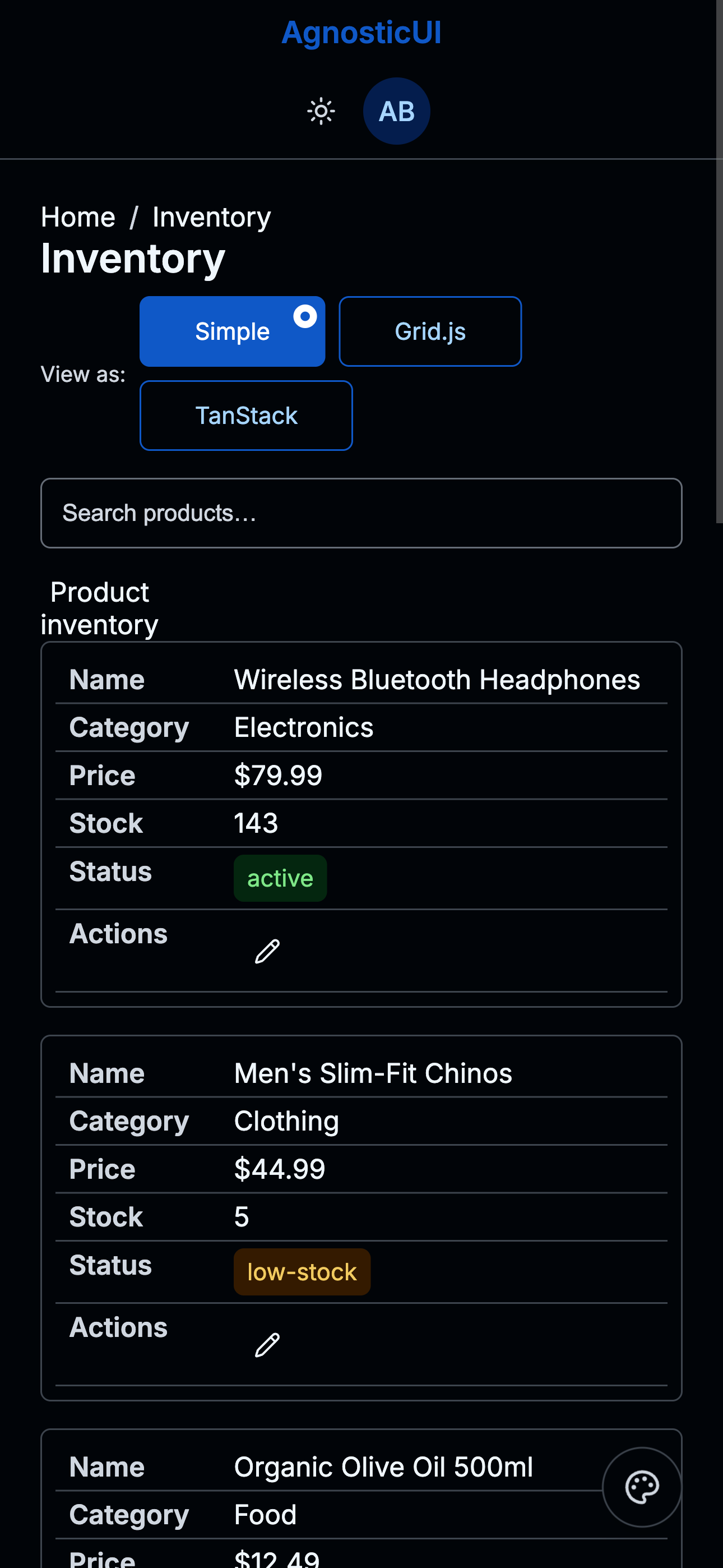
Mobile - Dark
Tablet
Tablet - Dark
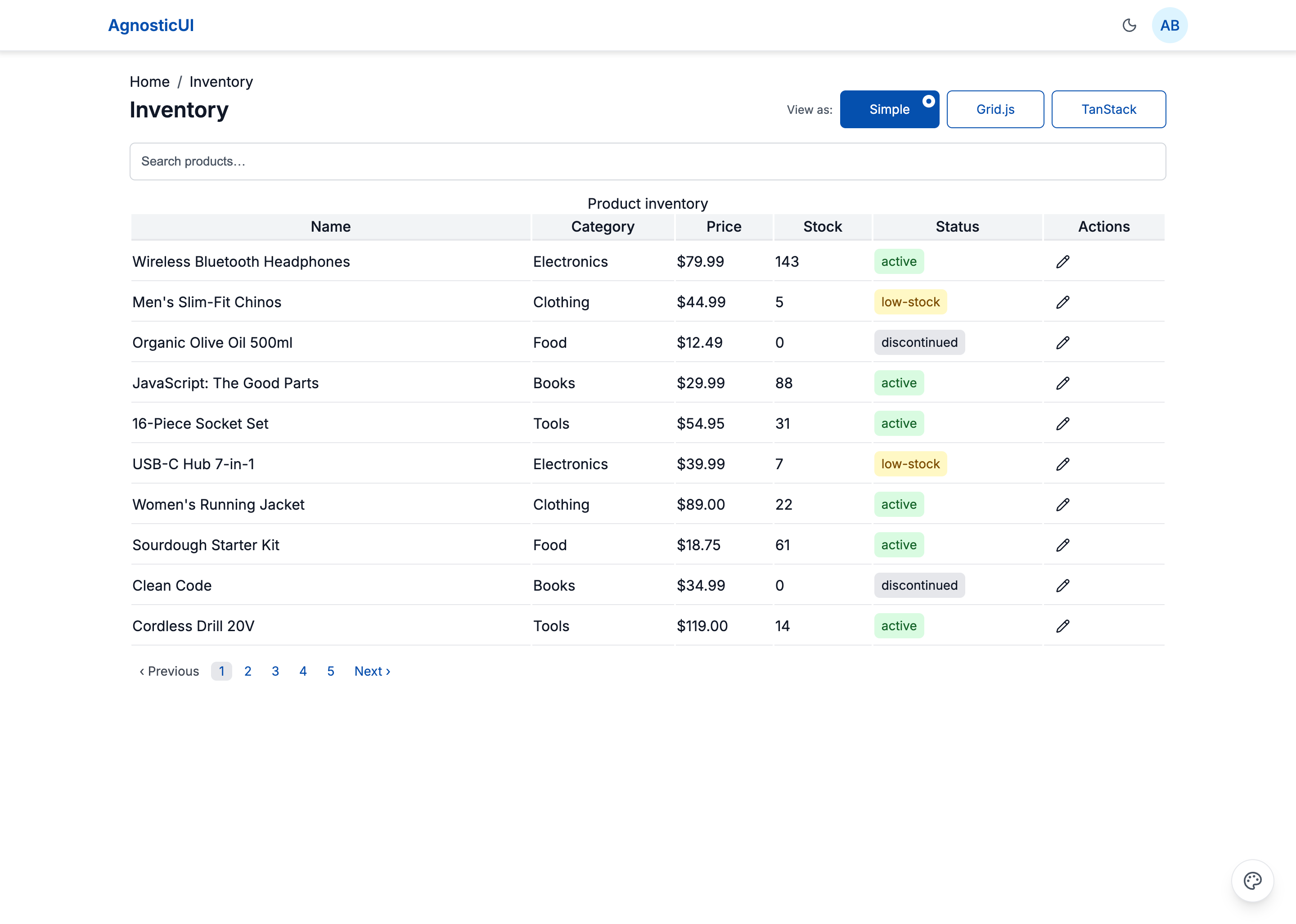
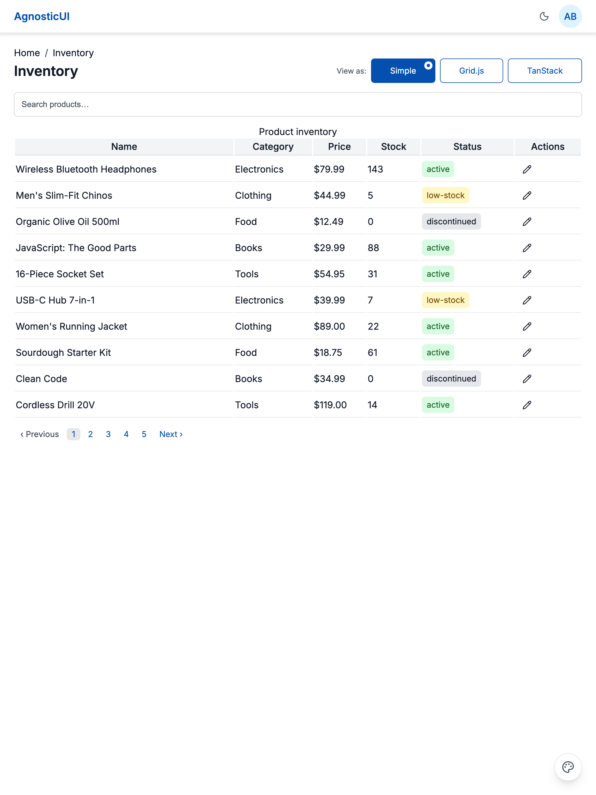
Desktop
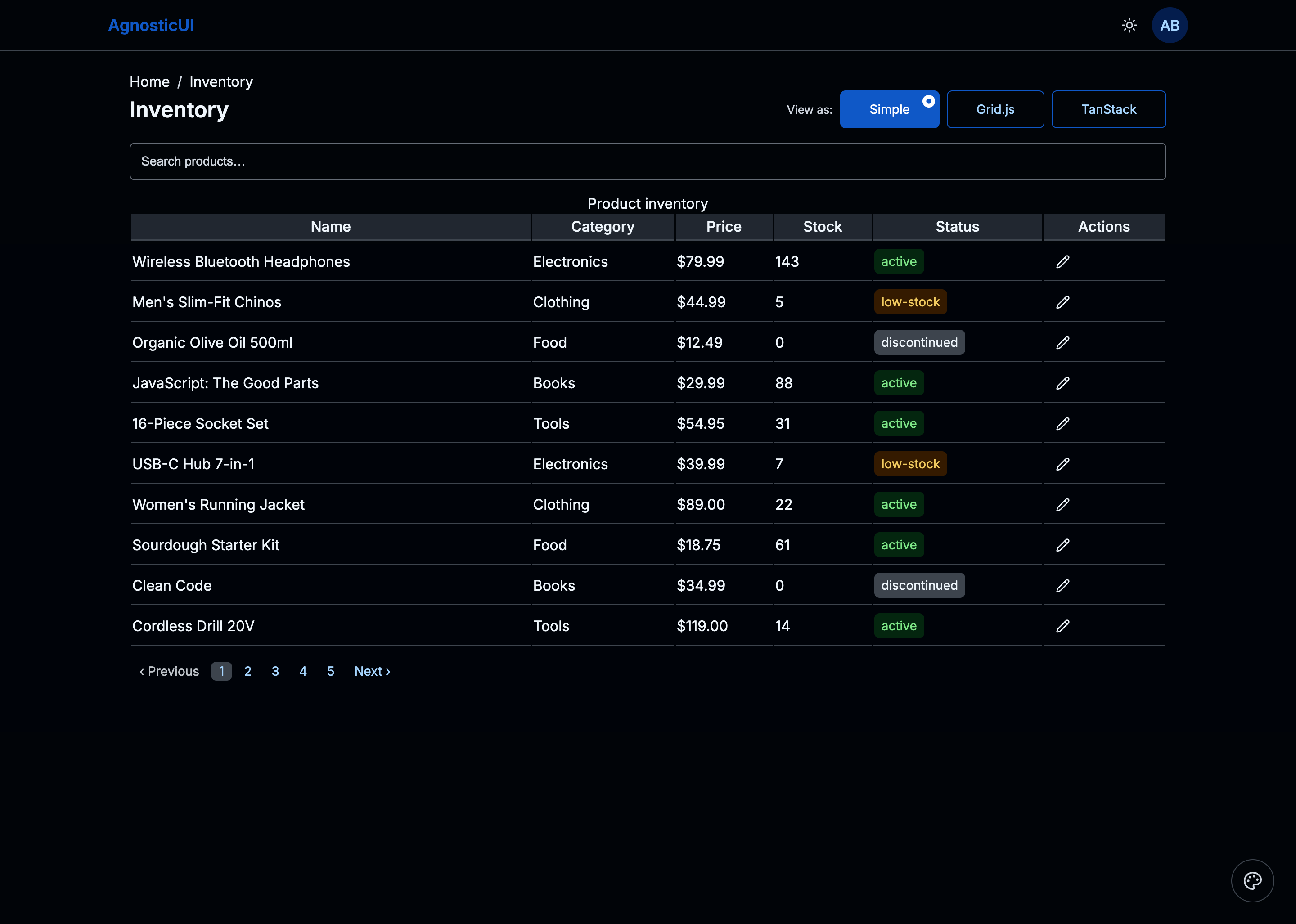
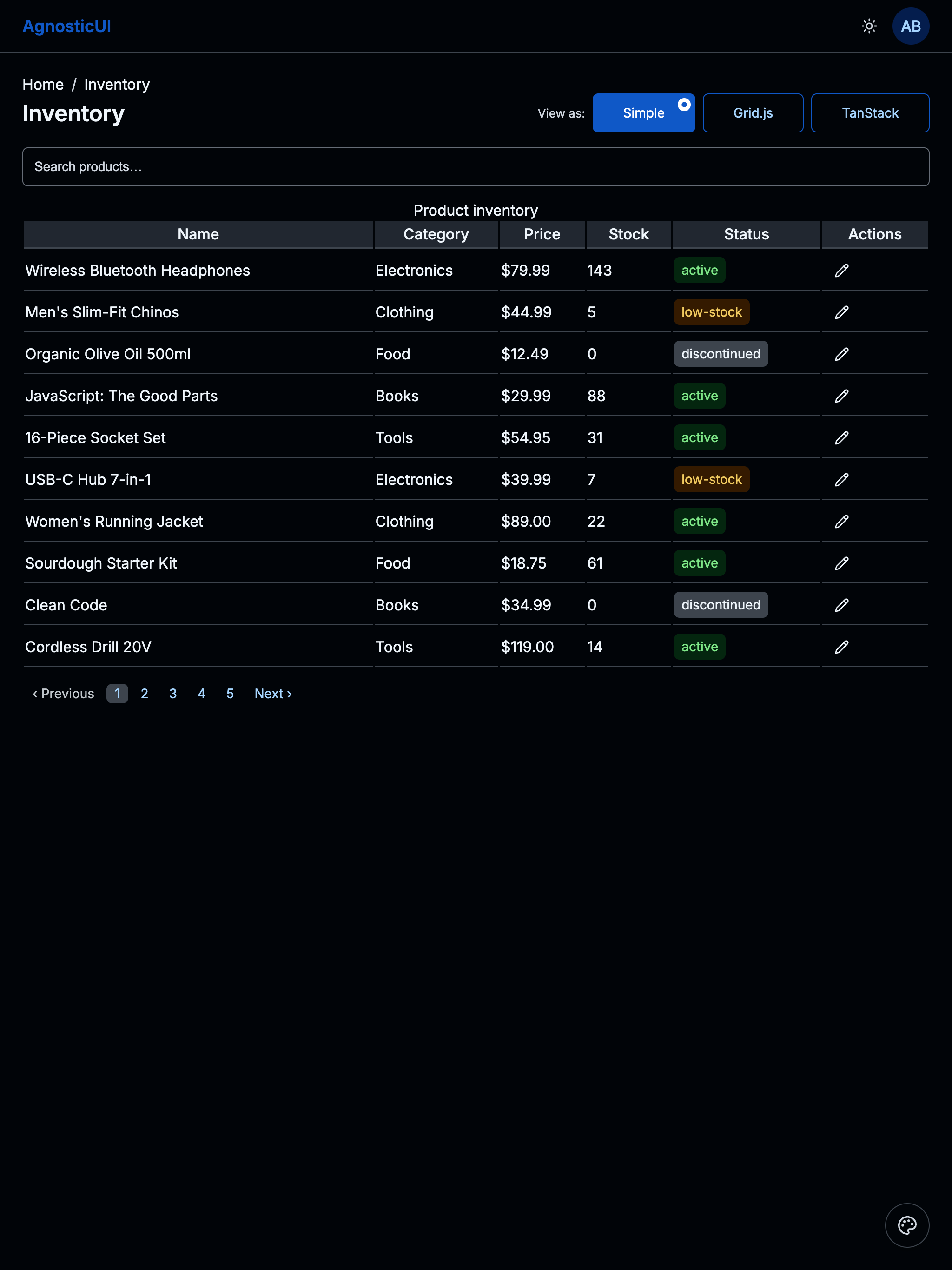
Desktop - Dark
Skins & Customization
Screenshots show the default skin. Each live example includes a skin switcher (bottom-right corner) to preview other themes instantly. Colors, spacing, and typography are fully customizable via design tokens.
What's Included
Experimental Feature: AI-Assisted UI Generation
Generating UI components via LLM prompting is non-deterministic; different models (and even different versions of the same model) can produce drastically varying results from identical prompts.
While these prompts have been tested using the Claude Code CLI (running Claude Sonnet 4.5 and Opus 4.5), the output remains experimental. Always verify generated code for visual consistency, accessibility, and production readiness before deployment.
- Three framework examples: React, Vue, and Lit implementations
- Simple Panel: AgnosticUI Table with search, column sort, status Tags, edit Toast, EmptyState, and Pagination
- Grid.js Panel: Drop-in grid with built-in search, sort, and pagination — bridged to
--ag-*tokens via targeted CSS overrides - TanStack Panel: Headless table with global search, column filters, multi-sort, column visibility Menu, row selection, bulk delete Dialog, page-size Select, and Pagination
PROMPT-3-FRAMEWORKS.md: Feed directly to your LLM for AI‑assisted customization
Using with an LLM
The PROMPT-3-FRAMEWORKS.md file contains everything an AI assistant needs to understand and modify the grid:
- Copy the
PROMPT-3-FRAMEWORKS.mdcontents - Paste into Claude, ChatGPT, or your preferred LLM
- Ask for customizations: "Add a bulk export button that downloads selected rows as CSV"
Components Used
| Component | Purpose |
|---|---|
ag-alert | Integration note above the Grid.js panel |
ag-avatar | User profile icon in the header |
ag-breadcrumb | Home / Inventory navigation trail |
ag-button | Actions, delete, and toolbar triggers |
ag-checkbox | Row selection in TanStack panel |
ag-dialog | Bulk delete confirmation |
ag-empty-state | Zero-results placeholder across all panels |
ag-header | Top navigation bar with theme toggle and avatar |
ag-icon-button | Per-row edit action |
ag-input | Search and column filter inputs |
ag-menu | Column visibility toggle in TanStack panel |
ag-pagination | Page navigation below each panel |
ag-select | Category filter and page-size selector |
ag-selection-button | Individual "View as:" toggle option |
ag-selection-button-group | "View as:" panel switcher (Simple / Grid.js / TanStack) |
ag-table | Table markup for Simple and TanStack panels |
ag-tag | Status labels (active / low-stock / discontinued) |
ag-toast | Edit and delete confirmation notifications |
Responsive Behavior
| Breakpoint | Layout |
|---|---|
| Mobile (<768px) | Card layout — each row becomes a labeled card |
| Tablet (768–1199px) | Table layout — Category column hidden to save space |
| Desktop (≥1200px) | Full table with all columns visible |
Variant II — Enhanced TanStack Panel
Extends the Data Grid with three new components — Spinner, ProgressRing, and IntlFormatter — embedded directly into the TanStack panel. Price columns are formatted with IntlFormatter (USD locale), a ProgressRing shows bulk operation progress, and a Spinner replaces the skeleton loader during async data fetches.
Skins & Customization
Screenshots show the default skin. Each live example includes a skin switcher (bottom-right corner) to preview other themes instantly. Colors, spacing, and typography are fully customizable via design tokens.
What's New in V2
Experimental Feature: AI-Assisted UI Generation
Generating UI components via LLM prompting is non-deterministic; different models (and even different versions of the same model) can produce drastically varying results from identical prompts.
While these prompts have been tested using the Claude Code CLI (running Claude Sonnet 4.5 and Opus 4.5), the output remains experimental. Always verify generated code for visual consistency, accessibility, and production readiness before deployment.
- Spinner — replaces SkeletonLoader during async data fetch on panel mount
- ProgressRing — shows bulk operation completion (e.g. "Deleting 12 rows…") as a ring indicator
- IntlFormatter — formats the Price column as USD currency and dates to locale-appropriate strings
PROMPT-3-FRAMEWORKS-V2.md: LLM prompt for the V2 variant (all three frameworks)
Components Added in V2
| Component | Purpose |
|---|---|
ag-spinner | Loading indicator during async data fetch |
ag-progress-ring | Bulk operation progress (e.g. deleting rows) |
ag-intl-formatter | Locale-aware price (USD) and date column formatting |